We couldn’t be more thrilled to share the cover of Lyndsey Ellis’ debut novel, BONE BROTH, forthcoming from Hidden Timber Books in May 2021. As a bonus, we invited author and artist to share their process in designing the perfect cover.
Author LYNDSEY ELLIS and Artist JADE BUREL in conversation.
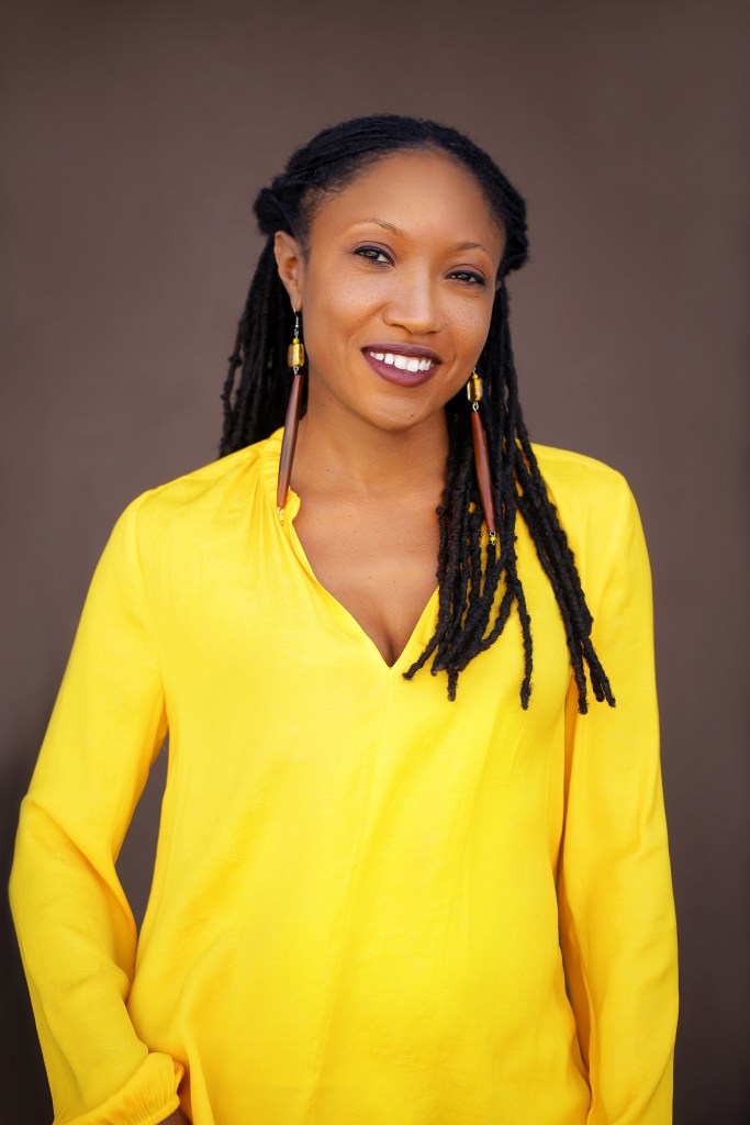
(Photo: Lyndsey Ellis) The story has been with me for so long, I didn’t imagine it would be difficult conceptualizing the cover image of Bone Broth. Yet, it felt nearly impossible to conjure up images that would best represent what the book is about while drawing the attention of potential readers. I knew I wanted it to involve lots of color and be reflective of the family—or at least the main character, Justine—who I’d become familiar with in my mind as I was developing the novel. But, that was it.
In the early stages of finding a designer who could help, Christi Craig of Hidden Timber Books sent over some mock-ups by one candidate. The images were beautiful and serene with explosions of color and layers that told a story. Unfortunately, just not this story. We decided to keep searching and remained open to the idea that something was out there that would be a great fit.
As we continued to search for a designer, I found Jade Burel, a fellow St. Louisan with an amazing online portfolio. Everything about her work—the colors, the variety, the Afrocentrism—screamed Yes! Excited, I reached out to her, and she graciously responded.
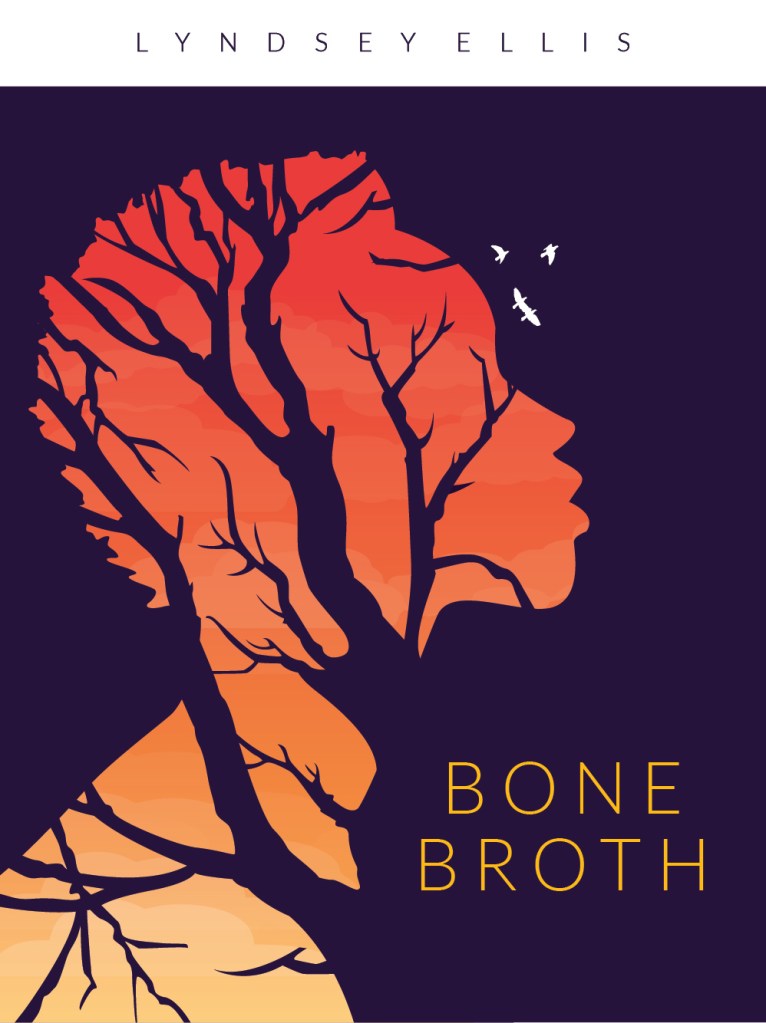
After our intro meeting, Jade encouraged me to send the first few chapters of BONE BROTH to get a sense of what the novel was about, as well as examples of covers that appealed to me. She assured me that she would take it from there, in terms of designing a few rough drafts. Although I still didn’t know exactly what I was looking for, I referenced aspects I appreciated from the last mock-ups that we’d reviewed to help navigate my search for images to send Jade. Within a couple weeks of receiving the novel excerpt and cover examples, she sent rough drafts that Christi and I both loved immediately. The color palette, the profile image of the main character, and the tree branches that symbolize a key element in the story, all spoke to me and gave me confidence that we’d finally struck gold. From there, we articulated our ideas for small revisions to Jade. She delivered and Voila! The cover for BONE BROTH was born.
A lot of time and energy goes into the cover of a book, much of which many people may not realize. Since this is very much a collaborative effort, we decided to get details about the cover design process from Jade in her own words. Here’s what she had to say:
Tell me a little about your background. How did you get into visual art/graphic design? Who/what inspires you?
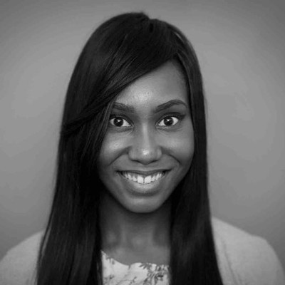
(Photo: Jade Burel) I have always had a creative eye, even as a kid. I was the little black girl who was very shy/quiet and nerdy, who kept to myself and always did what I was told. The full good girl archetype. Books and drawing were my safe haven. It was where I was allowed to express myself and my imagination, my thoughts; my creativity coming to life. I started drawing when I was 9 years old and did fine art up until college (and even in college I took a multitude of fine art courses such as figuring drawing, painting, ceramics, tons of art history classes). But college was where I first discovered my love from graphic design.
I am influenced by spirituality, love, kindness. I have been into Afrocentric surrealism heavy lately. I am passionate about bringing awareness to womanism, I am inspired by black activism and black culture/black beauty/black history/black people. My art is a reflection of all that is inside of me, a reflection of what’s happening in the world, a reflection of change, making beautiful visuals that beautifully affect myself and the audience in a positive way.
Do you have a routine or special process when you approach your work or ideas for a design? How do you bring what you have in mind into fruition?
I have a couple of design rituals that really help spark my drive to create. Meditation for one. Clearing your consciousness and refreshing the mind, body, soul is important for any kind of creativity. You want your thoughts to be light and fluid. Then it’s time to pull inspiration. Pinterest is a very good resource for just about anything but for creative and design inspiration in particular its extremely helpful. Dribbble is another good source. I also look to other black creatives I come across via Instagram, LinkedIn, etc. I love to look at other artists’ perspectives because it gives you insight into their world and their minds. Externally as a creative you are naturally observant so I pull inspiration making mental design notes of all the things I encounter on a day to day that gets my attention. That looks like paying attention to the branding and packaging of a food item I just bought. I could be driving on the highway and notice a cool billboard, at a restaurant and looking how they presented the menu, looking at the UX/UI displays of my favorite streaming services. But my top resources are my clients. Most times they already come in with ideas ready and it’s my job to shape and mold those ideas accordingly to fit their vision but also stays true to my own aesthetic.
After speaking with me and getting details about the parameters for the book cover, what was your process of designing it? How did you brainstorm? Were there any challenges, and how did you overcome them?
Working with Lyndsey was a breeze. Her creative direction was already clearly defined so it was merely up to me to put those Adobe skills to use. I think the key was the use of layering to add depth and finding the perfect colorway. The layering of the silhouette of the black woman’s head and inside seeing the branches, adding the gradient for a sunset- like effect to the sky in contrast with the deep purple. The symbolism of the birds, the subtle addition of the clouds, and the thinness of the text weight in the typography; almost bone like.
What else would you like people to know about you and/or your work?
I think in life one of our goals is to leave a legacy of some sort behind, something that will people will remember you by. My art is one of my legacies. I said if I can touch someone deeply, just one person, then I have done my job. That person will touch someone, and that person will touch another until there is an entire ripple effect. I’m just happy to be part of that ripple.
JADE BUREL is a 27 year old illustrator and graphic designer. Having extensive knowledge and an advanced skill set of the Adobe creative suite, she has been actively working in her career field since graduating magna cum laude from the University of Missouri-St. Louis in 2015 with a Bachelor of Fine Arts and Communications, with an emphasis on graphic design.
Jade has worked for a variety of distinguished design firms in the St. Louis area touching a multitude of creative projects for notable clientele. She currently works as a graphic designer for the start-up tech company, LockerDome, located in downtown St. Louis. Apart from the professional design world, Jade also freelances part-time where she indulges in surrealist, conscious, and clean design that compliments bold typography and flamboyant color waves. In her down time (designing aside), she enjoys being a mom to her 6 year old son, Tahj, and pup, Lucky. She’s also an active spiritualist, womanist, and activist.
